
Will this Ad and Cover:
Click or Flick?
This ad showed up in my FB (my personal one, maybe I should have one for this blog? For another place to dump my goblin chaos thoughts?) doomscrolling feed:
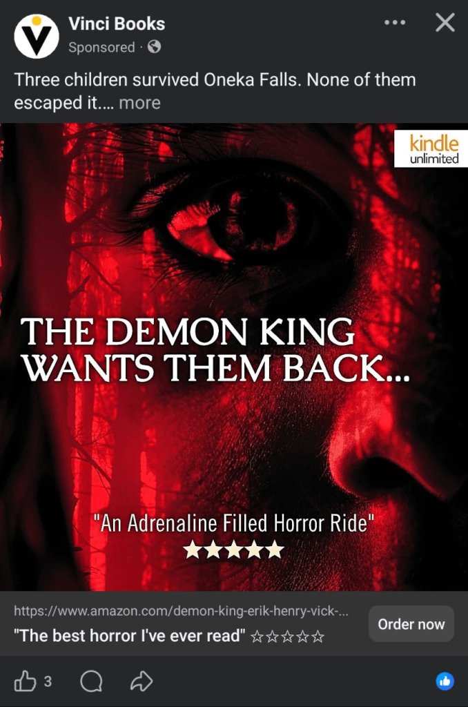
As we all know, I’m a spoopy b!t¢π, and red is my favorite color.
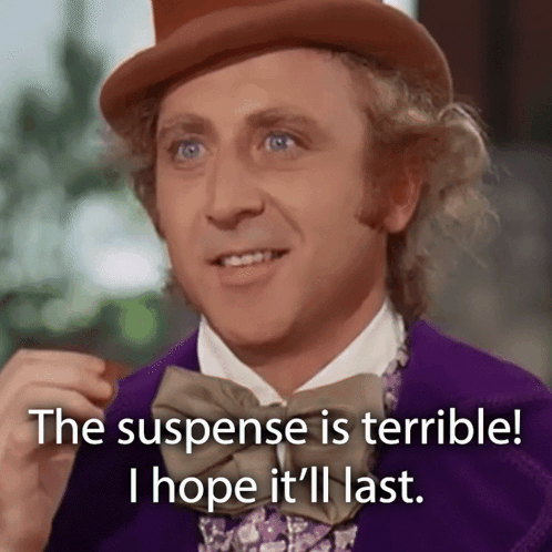
This ad immediately reads dark, spooky, suspenseful, horror, thriller, I may have nightmares if I click onto this because it says “Demon King.”
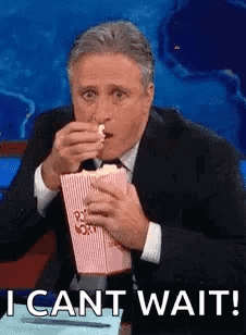
Sooooo, what did I do?
I CLIIIIICKED!!!

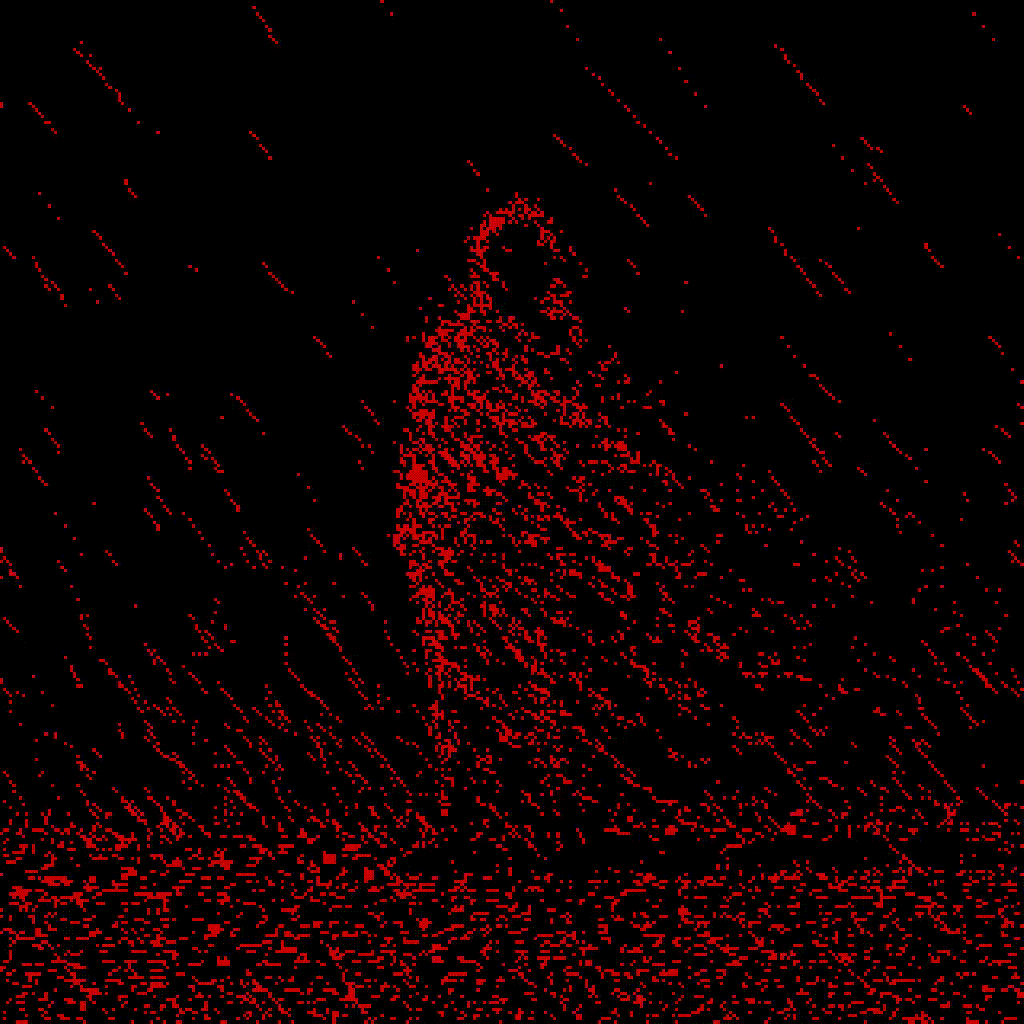
As I waited in the T-minus 2 seconds it took for my phone to load, I wondered if the cover would match the ad in vibes? Or even match the ad itself!
BEHOLD!!!
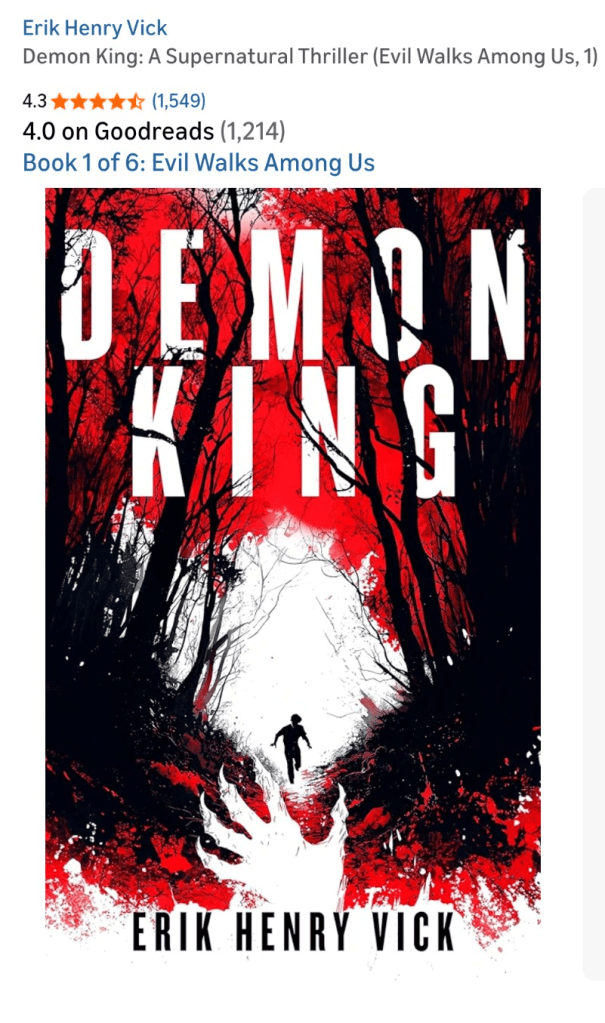
Not the same visual. But the vibe Absolutely matched.
The reds, black, and white are high contrast, which draws the eye and keeps it from feeling busy. I like how the title letters are sort of peeking out from the trees as well. Very nice! No disappointment here!
So, this was definitely a click, screenshot, and save to my list.
VERDICT: CLICK ✅
To be melodramatic, there’s nothing worse than seeing an ad that’s trying so very hard to get your finger to click on it only for the cover art to not match at all and you’re disappointed in the most betrayed way possible.
SnS 🌹💀📜🥤

Leave a comment